본문 영역
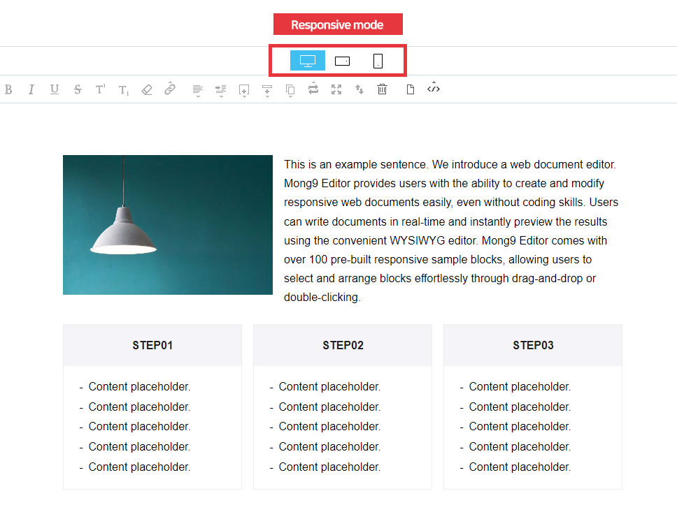
Responsive settings
Responsive web means that the size of the web page automatically changes according to the type of device such as PC, tablet PC, and mobile.
In the past, when creating web documents, PC type and mobile type were produced separately, but nowadays, technology is to produce one document to react according to the device.
Mont9 Editor makes responsive web documents easy, even without coding skills. Mont9 Editor offers over 100 sample blocks designed for responsiveness. While editing, you can instantly preview your content on PC, tablet, and mobile screens. This makes it easy for beginners to create responsive documents.
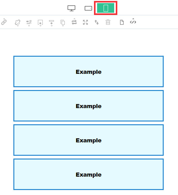
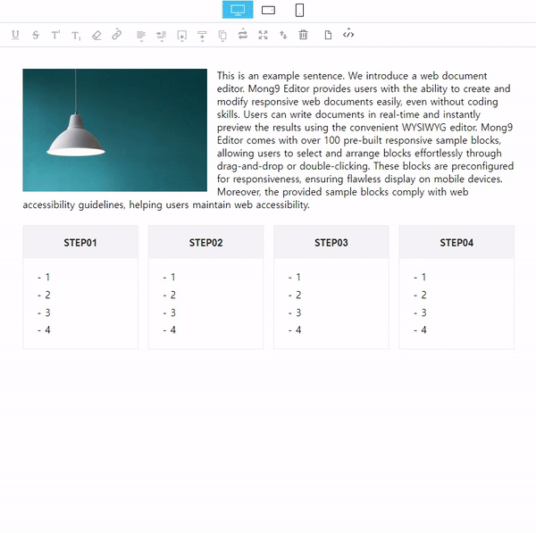
Responsive screen
You can adjust objects, layouts to fit the responsive screen.
Responsive Column Alignment
The column alignment button is a powerful feature unique to Mont9 Editor. The column alignment button appears only in mobile mode. You can use % to adjust the width of blocks on mobile so that they don't break, even if you initially created them in the PC version.
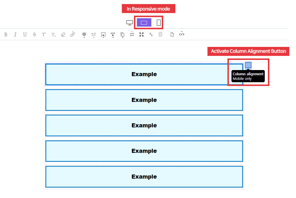
How to set
When you switch to mobile landscape or portrait mode in the mode window and select an object, the column alignment window on the right side.
At this point, you can change the object to a mobile-friendly width.
At this point, you can change the object to a mobile-friendly width.
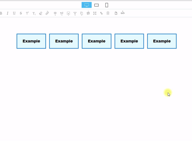
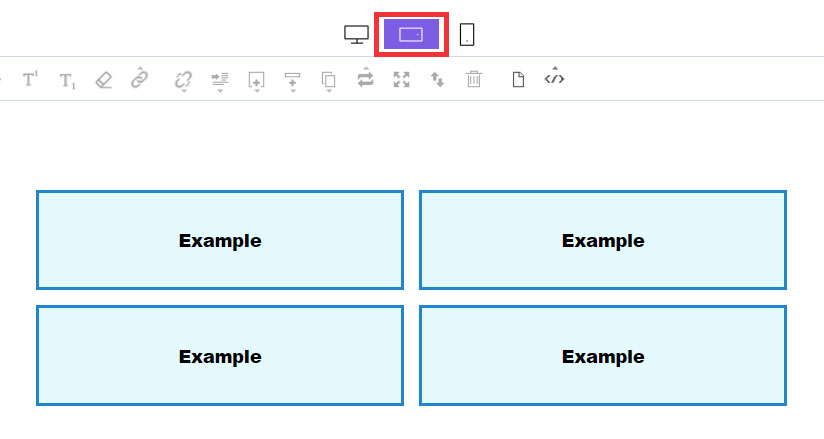
Result screen
1) PC mode
Each object is divided into 4 columns with a width of 25%.
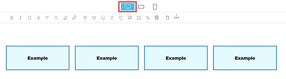
2) Mobile landscape screen mode
Each object is divided into 2 columns with a width of 50%.
3) Mobile portrait screen mode
Each object is divided into 1 columns with a width of 100%.