본문 영역
Basic rules.
Mong9 editor basically provides more than 100 sample blocks (
If you make more and more of these blocks, the
So, even with many blocks, we've kept the
Blocks). We will make and provide more blocks in the future.If you make more and more of these blocks, the
Stylesheet(CSS) will continue to grow and the loading will slow down..m9-grid-n, .m9-float-n support only 6 steps, CSSis getting too long, step 6 is the best we've determined.So, even with many blocks, we've kept the
CSS from getting complex.
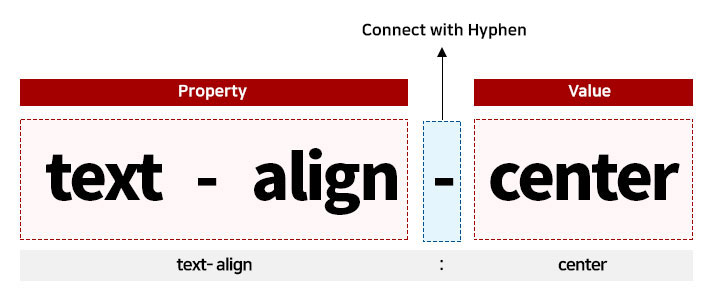
Classes are created using CSS properties and values.
- Create by connecting attributes and values with a hyphen (-).
Example:text-align:center=>.text-align-center - In Mobile landscape mode, add
m-at the beginning. =>.m-text-align-center - In Mobile portrait mode, add
e-at the beginning. =>.e-text-align-center
Add
m9- in front of the CSS created by Mong9Editor, and assign a number after each type.- For example:
.me-strong-1{font-weight:bold;color:red} - In Mobile landscape mode, add 'm-' at the beginning. =>
.m-m9-strong-1 - In Mobile portrait mode, add 'e-' at the beginning. =>
.e-m9-strong-1
Mong9 Editor uses four CSS files.
~/source/css/mong9-base.css=> Contains non-responsive CSS~/source/css/mong9.css=> Stores PC-only classes~/source/css/mong9-m.css=> Stores mobile landscape modem-classes~/source/css/mong9-e.css=> Stores mobile portrait modee-classes
Class Naming Guide
- If you have specific CSS properties and values, you can create classes.
- Use classes for things like
.vertical-align-topor.display-table, where it's clear what they mean and they won't confuse anyone. - But if the style depends on something specific, like a color #eee or a font size 14em, it's best not to make classes like
.color-grayor.font-size-14. - If you really want to, you can create custom classes to avoid problems with other tools.
- However, Mong9 Editor already has some special classes to help you. These special classes start with m9- and make it easy to style things, like
m9-f-largewhich represents font-size:1.16em.
- For example, if you want to represent font-weight:900 as a class, use
font-weight-900. - If you want to represent line-height:140 as a class, use
line-height-140. - If you want to represent float:left as a class, use
float-left.
Responsive Design
The Mont9 editor has predefined classes for easy responsive handling. To achieve responsiveness for mobile environments, simply add a prefix m- or e- to all classes in Mont9 editor.
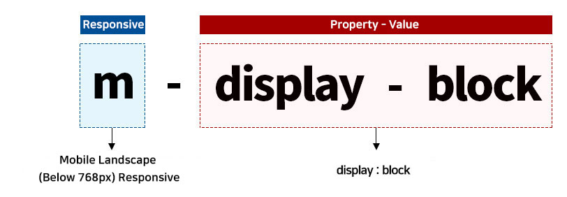
Mobile Landscape (Below 768px) Responsive
By adding the prefix m- to all classes, Responsive processing is possible.
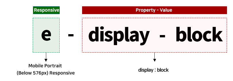
Mobile Portrait (Below 576px) Responsive
By adding the prefix e- to all classes, Responsive processing is possible.
- For example, if you want to change from position:absolute on PC to position:relative on mobile landscape, and to position:static on mobile portrait, you can use
position-absolute,m-position-relative, ande-position-static.
Usage Example
position
PC-Class
- .position-relative
- .position-absolute
- .position-static
- .position-fixed
CSS Code
Mobile Landscape - Class
- .m-position-relative
- .m-position-absolute
- .m-position-static
- .m-position-fixed
CSS Code
Mobile portrait - Class
- .e-position-relative
- .e-position-absolute
- .e-position-static
- .e-position-fixed
CSS Code
display
PC-Class
- .display-block
- .display-inline-block
- .display-inline
- .display-none
CSS Code
Mobile Landscape - Class
- .m-display-block
- .m-display-inline-block
- .m-display-inline
- .m-display-none
CSS Code
Mobile portrait - Class
- .e-display-block
- .e-display-inline-block
- .e-display-inline
- .e-display-none
CSS Code
display-table
PC-Class
- .display-table
- .display-table-row
- .display-table-cell
CSS Code
Mobile Landscape - Class
- .m-display-table
- .m-display-table-row
- .m-display-table-cell
CSS Code
Mobile portrait - Class
- .e-display-table
- .e-display-table-row
- .e-display-table-cell
CSS Code
flaot
PC-Class
- .float-left
- .float-right
- .float-none
CSS Code
Mobile Landscape - Class
- .m-float-left
- .m-float-right
- .m-float-none
CSS Code
Mobile portrait - Class
- .e-float-left
- .e-float-right
- .e-float-none
CSS Code
vertical-align
PC-Class
- .vertical-align-top
- .vertical-align-middle
- .vertical-align-bottom
CSS Code
Mobile Landscape - Class
- .m-vertical-align-top
- .m-vertical-align-middle
- .m-vertical-align-bottom
CSS Code
Mobile portrait - Class
- .e-vertical-align-top
- .e-vertical-align-middle
- .e-vertical-align-bottom
CSS Code
overflow
PC-Class
- .visibility-hidden
- .overflow-hidden
CSS Code
Mobile Landscape - Class
- .m-visibility-hidden
- .m-overflow-hidden
CSS Code
Mobile portrait - Class
- .e-visibility-hidden
- .e-overflow-hidden